Personal Brand [ BD ]
Structuring Philosophy Through Design
Before BD, there was no structured personal brand system. The question for me was simple: how could my philosophy, standards, and design approach be felt visually instead of only explained in words?
BD was developed as a personal brand framework rooted in clarity, structure, and restraint. I never wanted it to be loud. The point was to create a system that could support the work rather than compete with it.
In this case, I was also the primary stakeholder. The brand had to reflect how I actually work: precise, minimal, and focused on outcomes. At the same time, it also needed to speak clearly to collaborators, academics, and the wider design community. It had to function both as a portfolio identity and as a long-term personal mark I could keep building on.
BD came out of a gap I kept noticing between philosophy and presentation. My way of working was already structured and deliberate, but my own identity did not yet reflect that with the same level of coherence.
The goal was really about alignment. The way I think, design, and communicate needed to show up in a stable visual system. It had to feel professional, restrained, and intentional, without slipping into decoration or self-expression for its own sake.
What mattered most was that the identity would not try to stand out through noise. I wanted it to stand firm instead. Its role was to create a controlled environment where the work stays central and the structure stays visible. The system needed to support portfolio projects, academic material, and presentations without having to be reinvented every time.

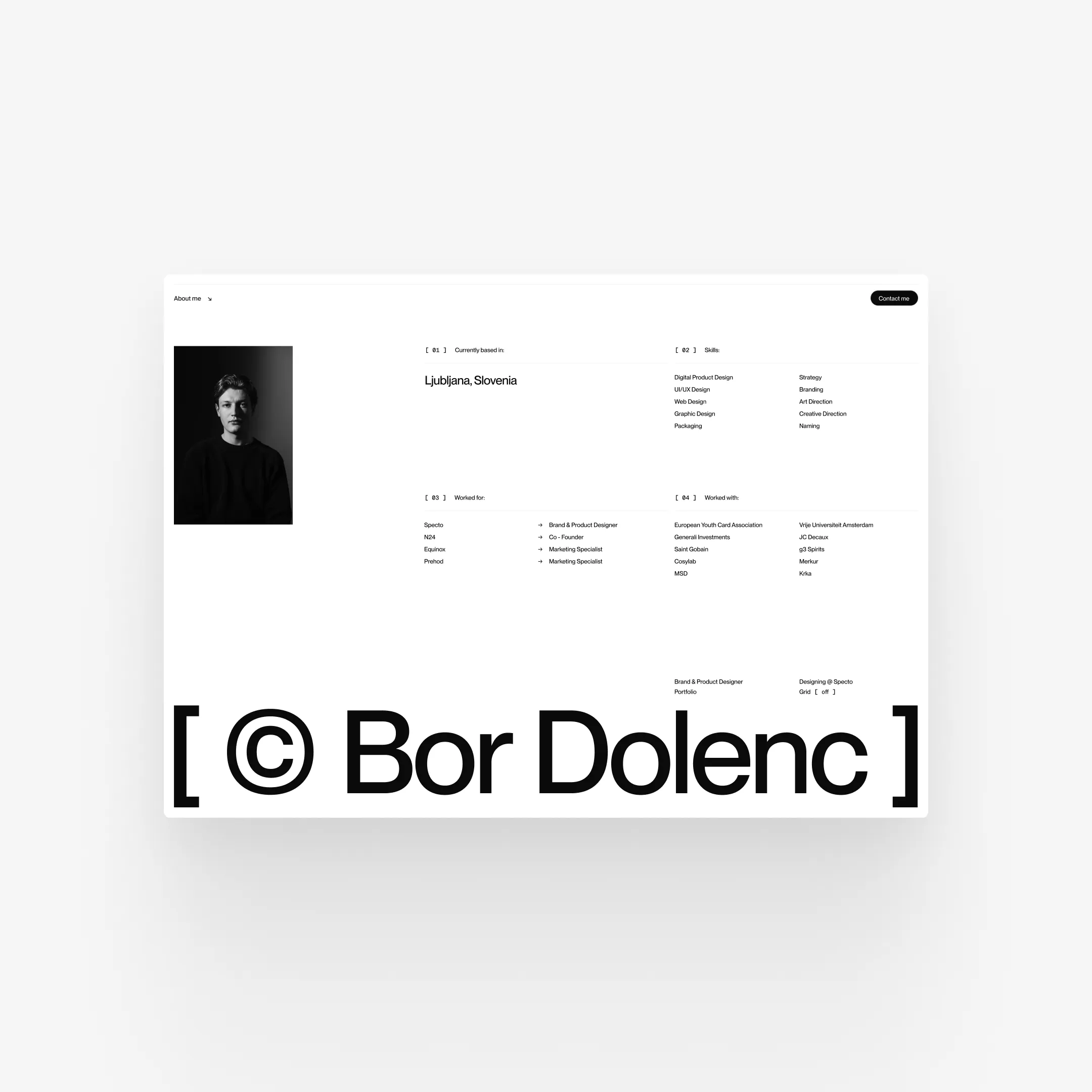
BD is built around a monogram that works more like a seal of authorship than a symbolic gesture. At one point I explored adding an extra graphic symbol, but it did not add enough structural meaning or geometric logic, so I removed it.
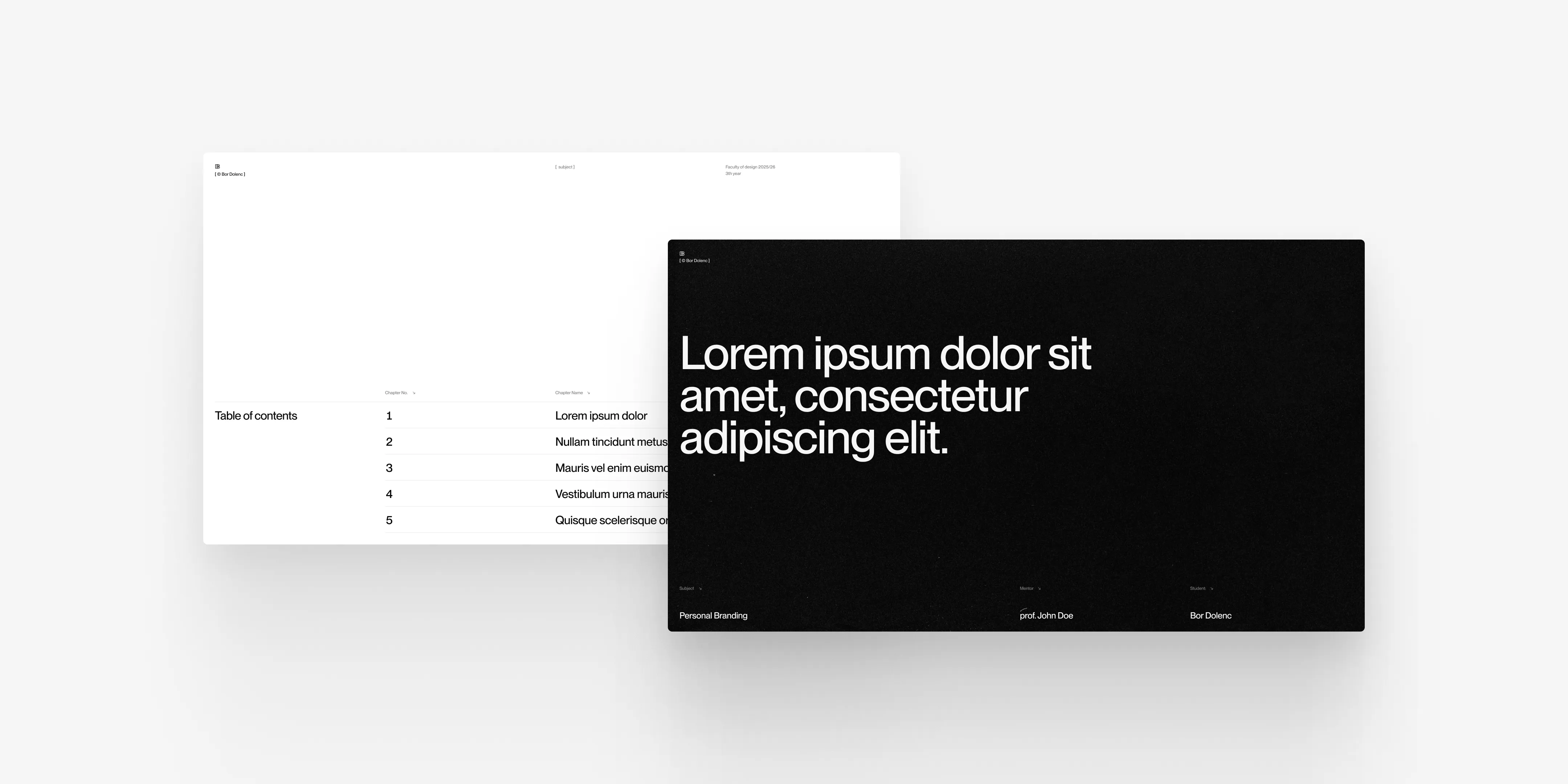
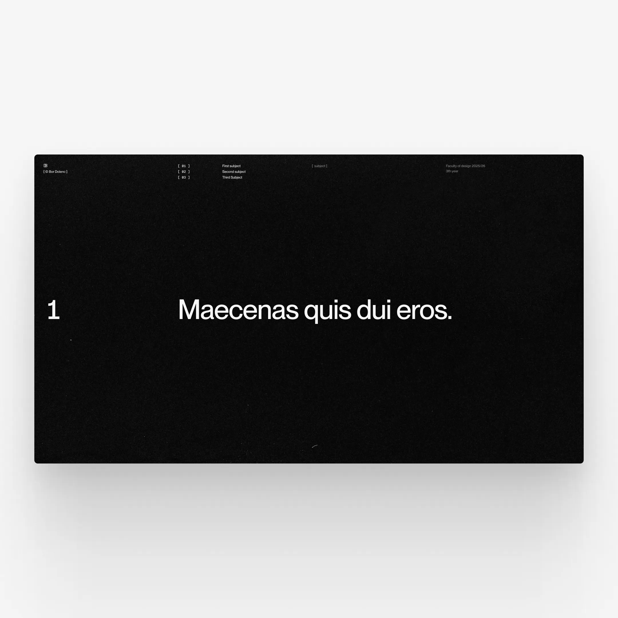
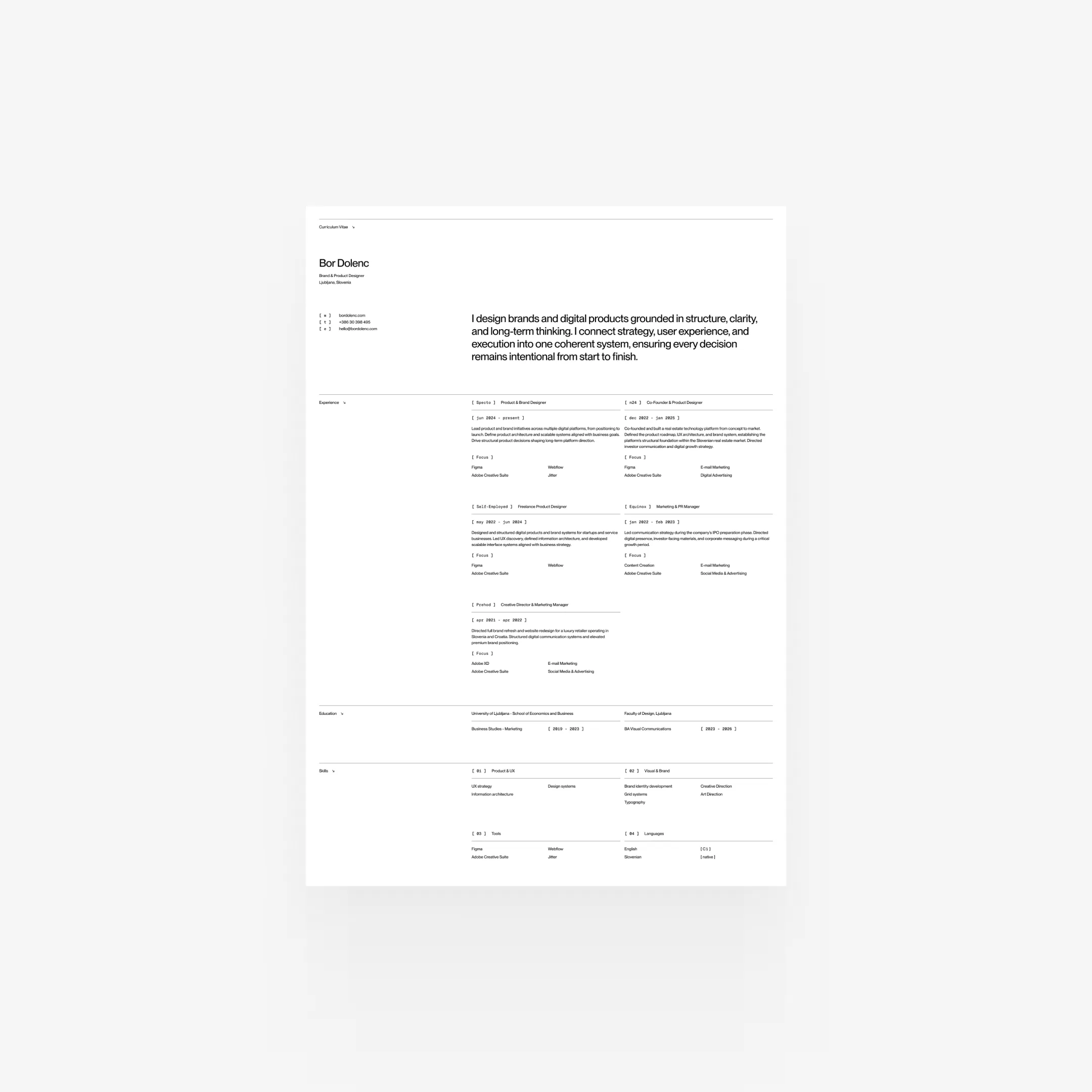
The whole brand is built on a strict grid system. For me, the grid was never about style preference. It was infrastructure. By defining limitations early, I could put more attention on hierarchy, typography, and clarity. More broadly, it also reflects how I think about design in general: introducing order where there is none.
The cover system uses black in contrast to mostly white interior layouts. That contrast helps mark transitions and structural shifts without needing ornament. Colour stays minimal. Typography stays controlled. Nothing is added unless it has a reason to be there.
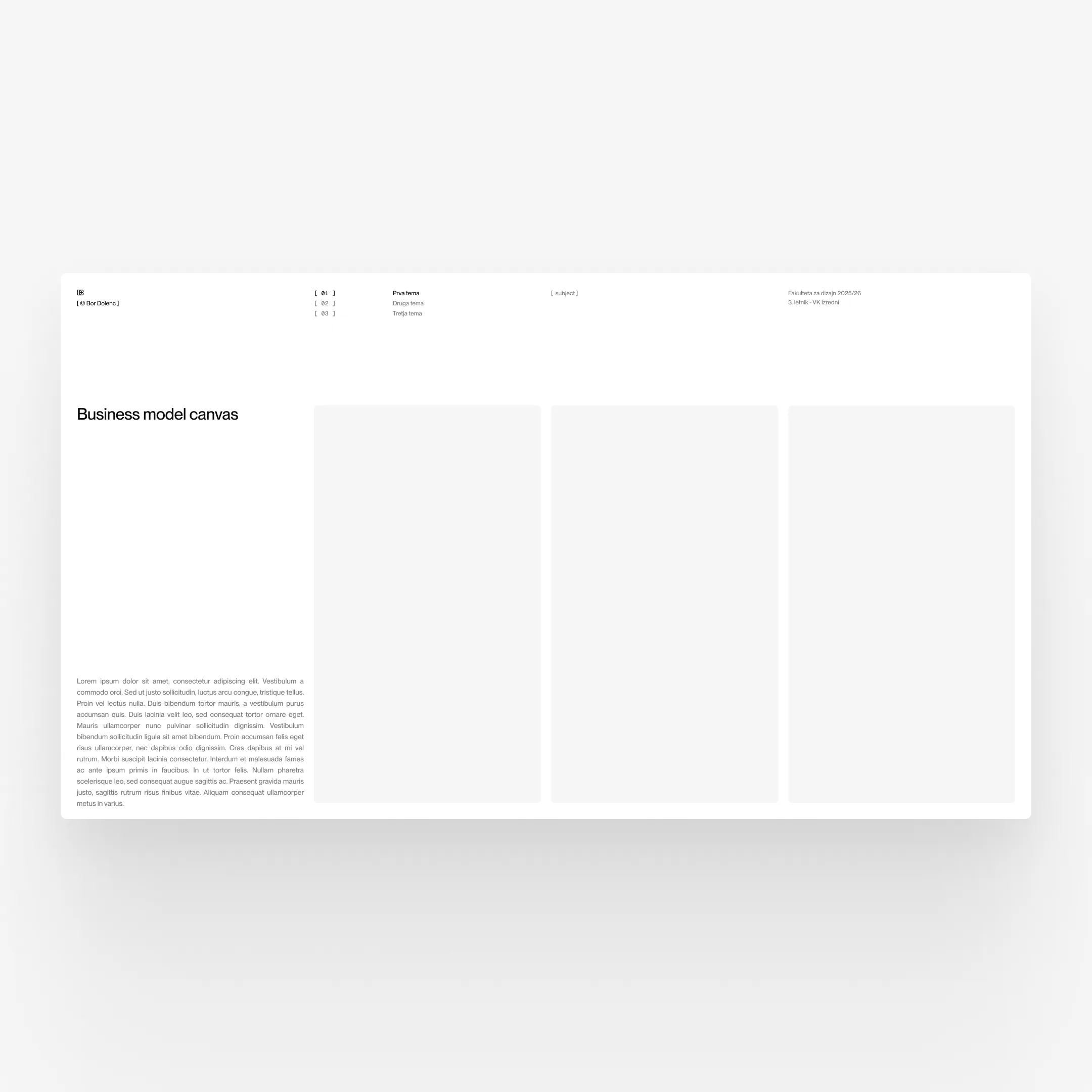
From the beginning, BD was developed as a system rather than a set of isolated assets. Presentation templates, portfolio structures, and document layouts were all defined in advance. That was important because the brand needed to reduce decision fatigue and make consistency easier across very different contexts.
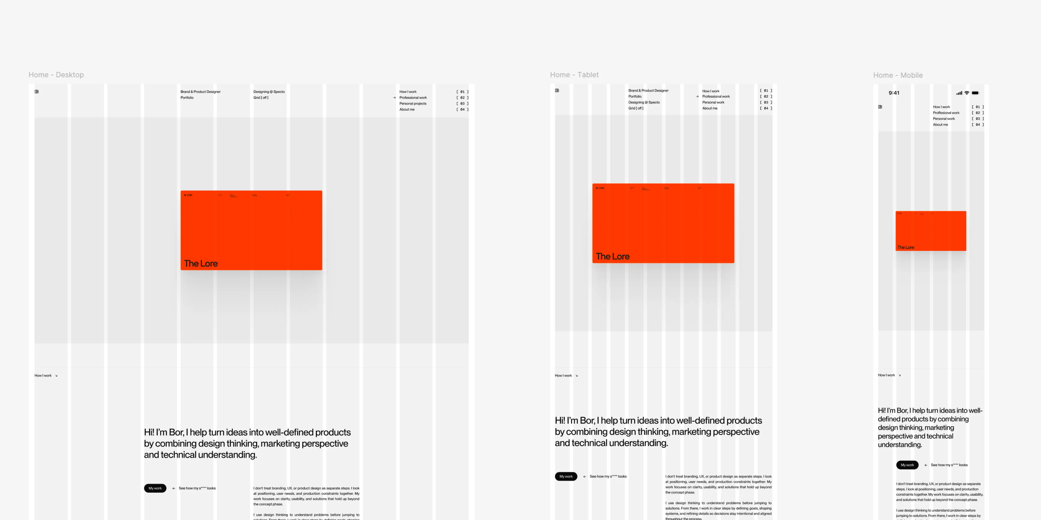
Each presentation, document, and portfolio update became a practical stress test for the system. It had to adapt to different subjects while still holding together. It needed to stay neutral enough to support different content, but structured enough to keep its identity.
With every new presentation, layout, or web design, I kept reassessing the framework. Anything that did not serve a clear purpose was removed. The layout logic was tightened. Proportions were adjusted again and again until the system could handle repeated use without starting to drift.
In this case, testing really meant durability. If the system could not support daily production, then it did not belong.
BD established a stable personal brand framework grounded in clarity and structure. It brought the visual presentation much closer to the working philosophy behind it and removed the ambiguity between process and perception.
What I value most is that the brand operates quietly. It works as a seal of authorship and reinforces a standard of precision without trying to pull attention away from the work itself. It reflects where my practice is now, while still leaving room for gradual refinement later. Its strength is not in constant reinvention, but in disciplined continuity.