Specto
Repositioning a Digital Agency as a Partner
How could Specto reposition itself from an undervalued contractor into a strategic partner, while keeping the strength and equity of the original brand?
By the time this project began, Specto had already grown into a team of more than 20 people with over a decade of experience, working with major clients in Slovenia and abroad. From the outside, we were seen as reliable. Internally, though, there was still a lack of alignment.
The brand no longer reflected where the company was heading. It still carried traces of our earlier role, when we worked beneath marketing agencies, delivering strong technical work while remaining strategically invisible. We had already grown beyond that position. The identity had not.

Specto originally started as a development partner for agencies. That role sharpened our technical discipline, but it also framed us as executors. As the company matured, we moved further upstream into strategy, product, and brand. Internally, however, the identity still felt fragmented. Materials lacked cohesion, and expectations were not always clear.
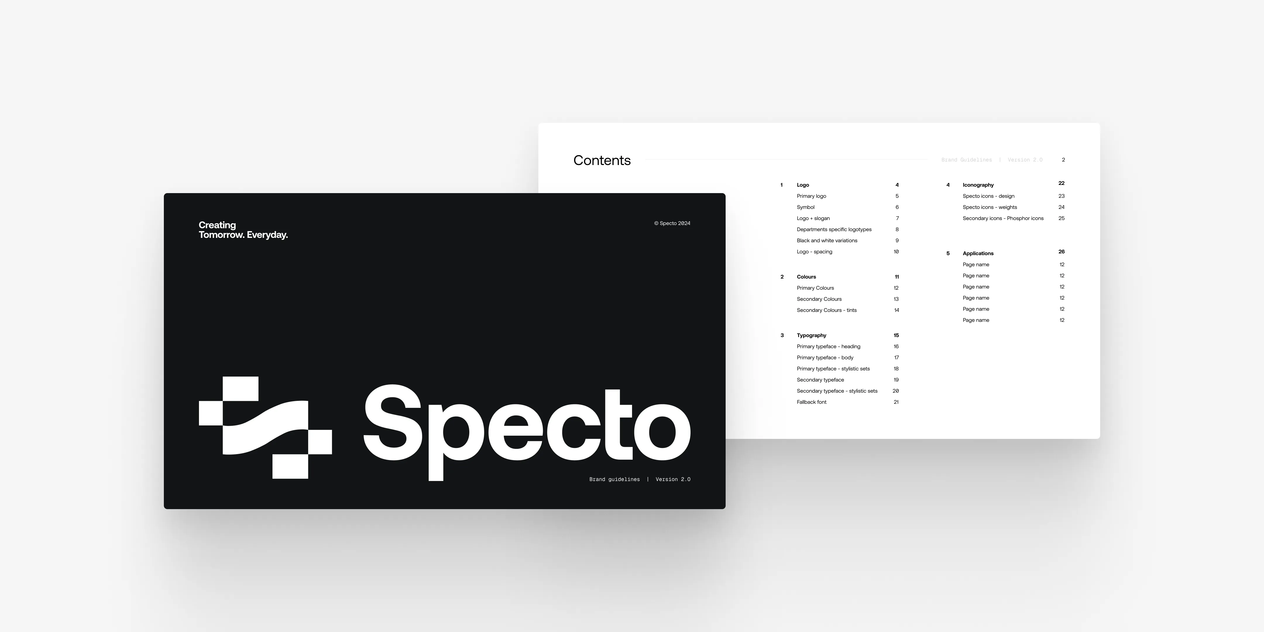
What made this project more interesting was that the foundation itself was not the problem. The original identity by Slavimir Futro already had real strength. The logo, wordmark, and typography resonated with the team and carried structural integrity. The issue was never the mark itself. It was the system around it.
So the project was less about rebranding in the usual sense, and more about bringing the identity into alignment with the role Specto had already grown into.
The first major decision was to preserve the logo and typographic foundation. This was not a reinvention project. It was an architectural one.
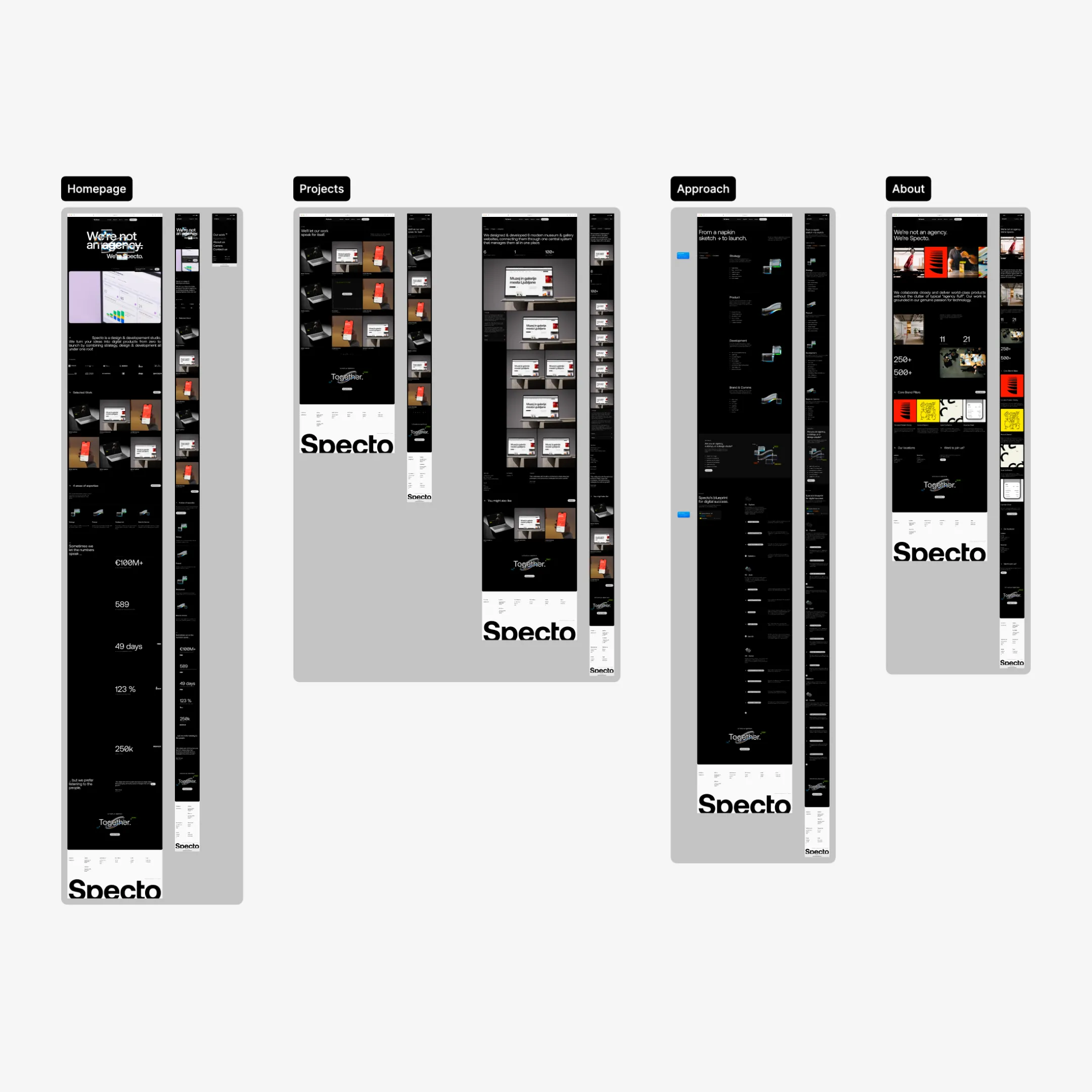
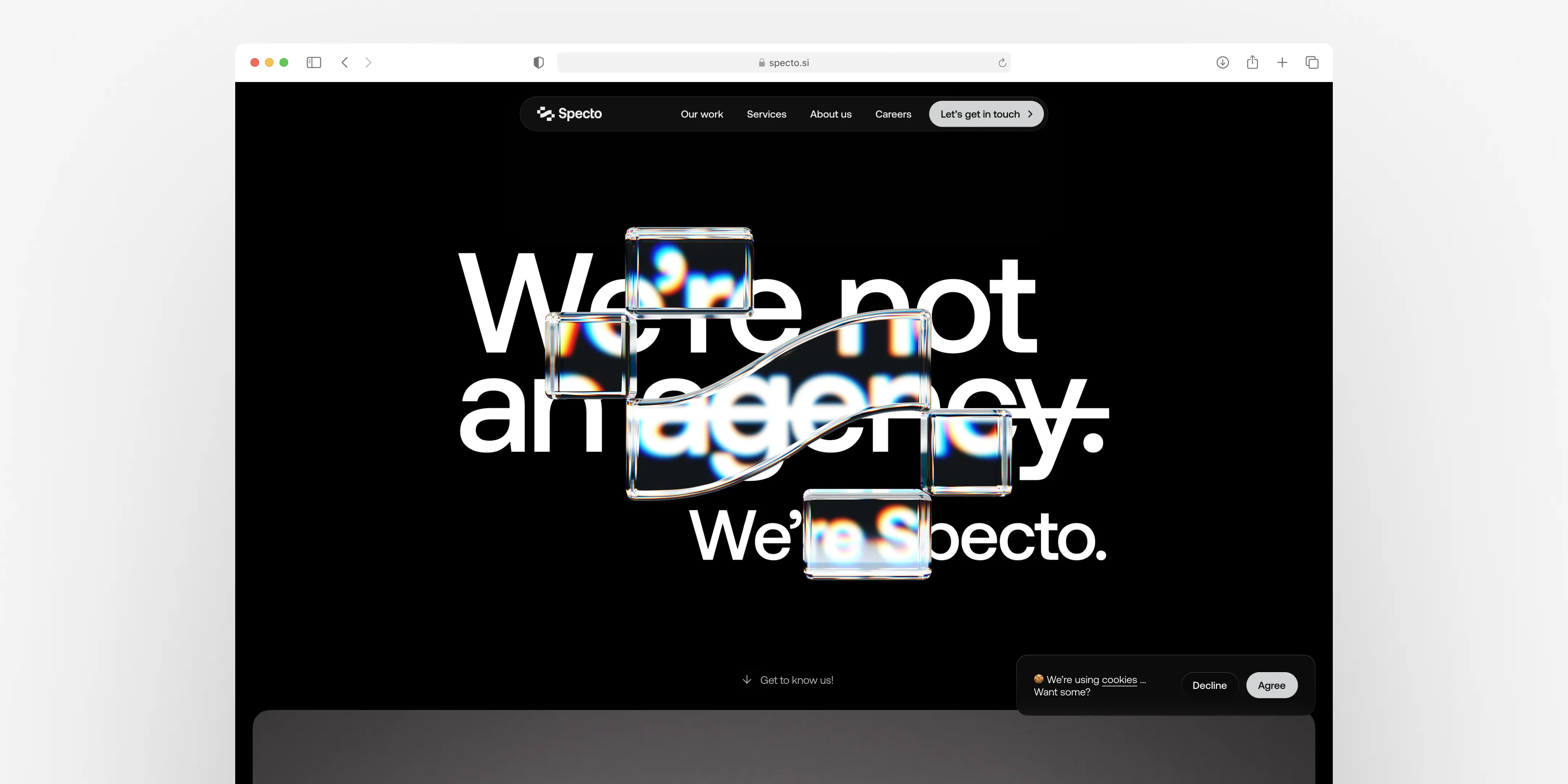
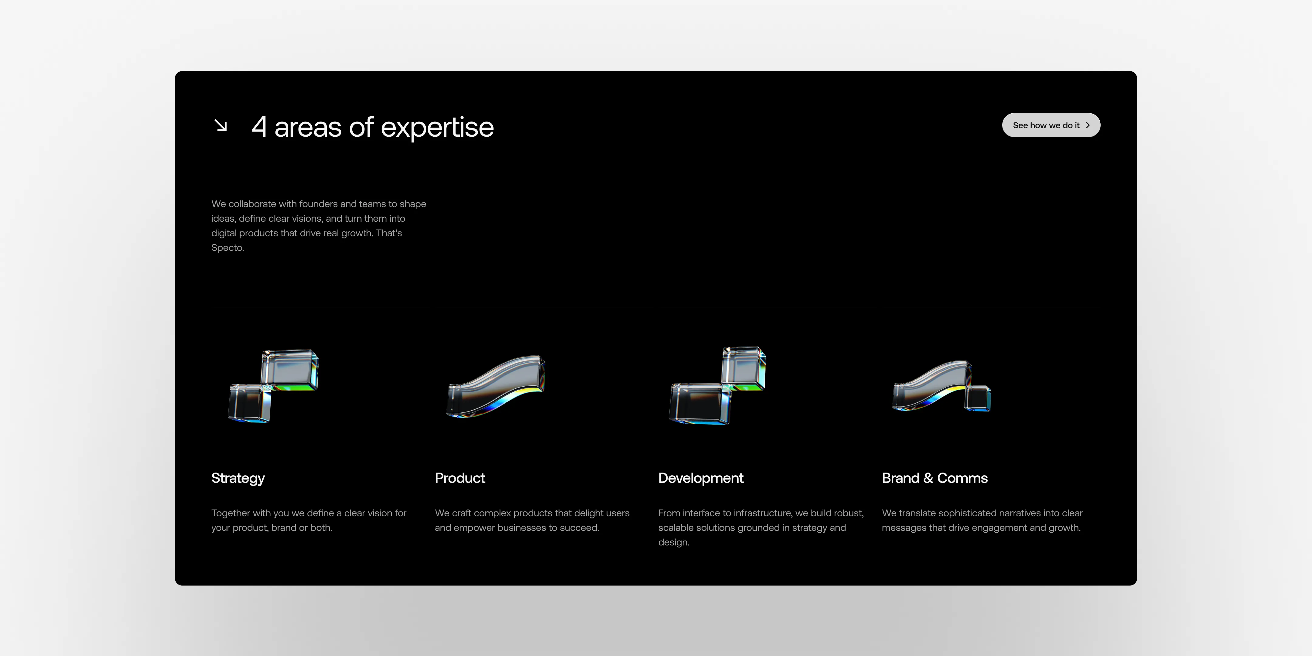
From there, the rest of the visual language was built out of the original geometry. The positioning line, We’re not an agency. We’re Specto, became more than a message. It became a structural idea for the whole system. The work was really about removing excess, tightening hierarchy, and reducing the tone to something more confident and less persuasive.
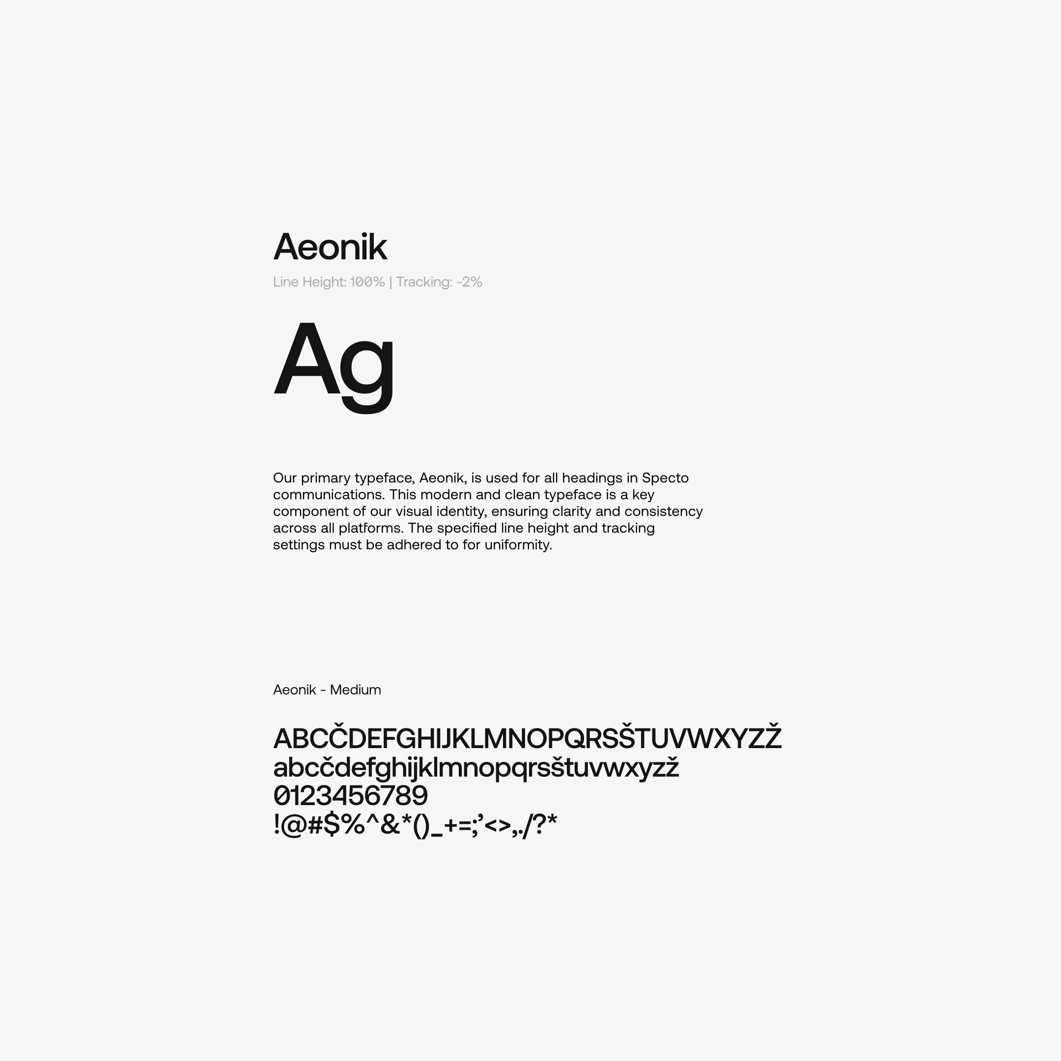
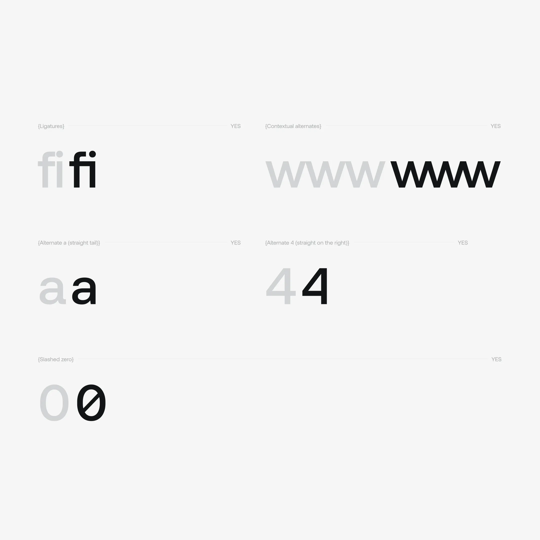
The black interface came naturally from Specto’s development background. Aeonik reinforced precision, while Geist and Geist Mono aligned well with the logic of systems and product thinking. Colour was reduced to keep the brand quieter and more focused. Motion and 3D added depth, but without turning into decoration. Nejc Prezelj translated that broader architectural direction into a cohesive motion and spatial language that fit the brand well.
A lot of the trade-offs came down to restraint. The question was never how much we could add, but how much we could remove while still making the shift feel clear.
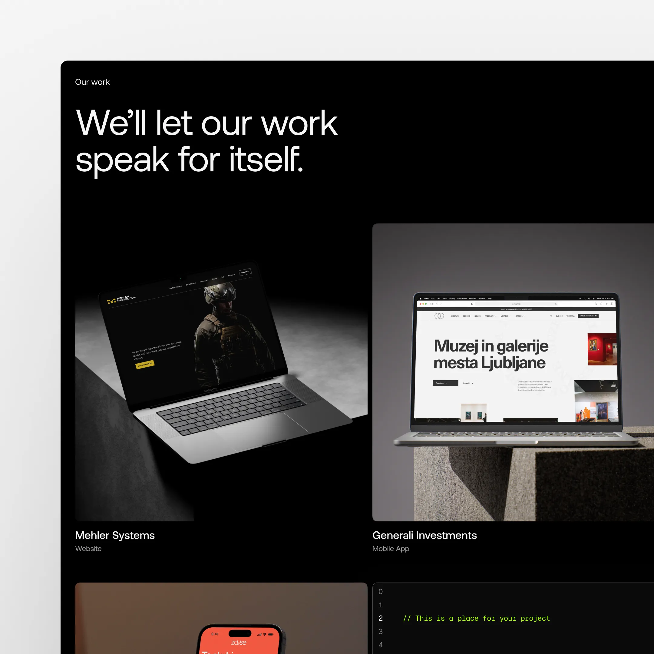
The first real test was internal. The team needed to recognize themselves in the new identity. Once that clarity was there, the system started extending into presentations, sales materials, and strategic documentation.
Each one became its own stress test. Layout logic was tightened. Motion was reduced where it needed to be. Copy went through repeated refinements. Because the project developed alongside active client work, insights from real projects kept feeding back into the next iteration of the brand and website.
Even legacy elements were revisited. The whale illustrations from the previous website nearly disappeared entirely. In the end, they were kept only as a small reference on the 404 page, which felt like the right balance between continuity and restraint.
This version of Specto feels stable, but not fixed. It is built for disciplined iteration, and its strength comes more from continuity than reinvention.
Internally, the shift was immediate. The team gained more clarity around what Specto represents and where it is going. Sales conversations changed as well. We stopped positioning ourselves as execution support and started speaking much more clearly as partners.
That shift also raised the bar. Confidence increased, but so did expectations. Externally, early feedback from presentations suggests stronger alignment with higher-value projects across strategy, brand, product, development, and communication.