Generali Investments
Redesigning a Mobile Investment Platform
How do you take a complex, regulation-heavy investment tool and turn it into something that feels intuitive on mobile, without losing compliance along the way?
That was the central question in this redesign. The app had to work within KYC requirements, mandatory disclosures, and backend limitations, but still feel clear, modern, and usable.
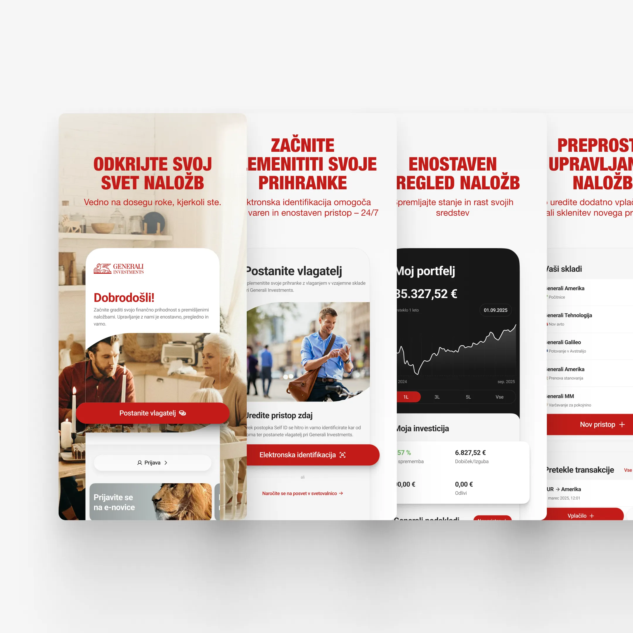
The previous Generali Investments app functioned more like a fund management tool than a mobile product. Onboarding required physical presence. The navigation followed a web structure. Portfolio data was dense and hard to scan. Red dominated the interface. It met operational requirements, but it did not offer a clear mobile experience.
Generali Investments manages actively managed funds for both new and experienced investors. The app needed to support fully digital onboarding, portfolio management, and transaction execution. This was a complete redesign.
What shaped the project most was the amount of structure that was already fixed. KYC onboarding rules, mandatory financial data display, backend-driven architecture, rigid transaction states, and corporate branding guidelines were all part of the reality from the beginning. The framework itself was not changing. The work was really about improving the experience inside those boundaries.
That is what made the project interesting to me. The challenge was not freedom. It was finding clarity inside a system that was already quite constrained.
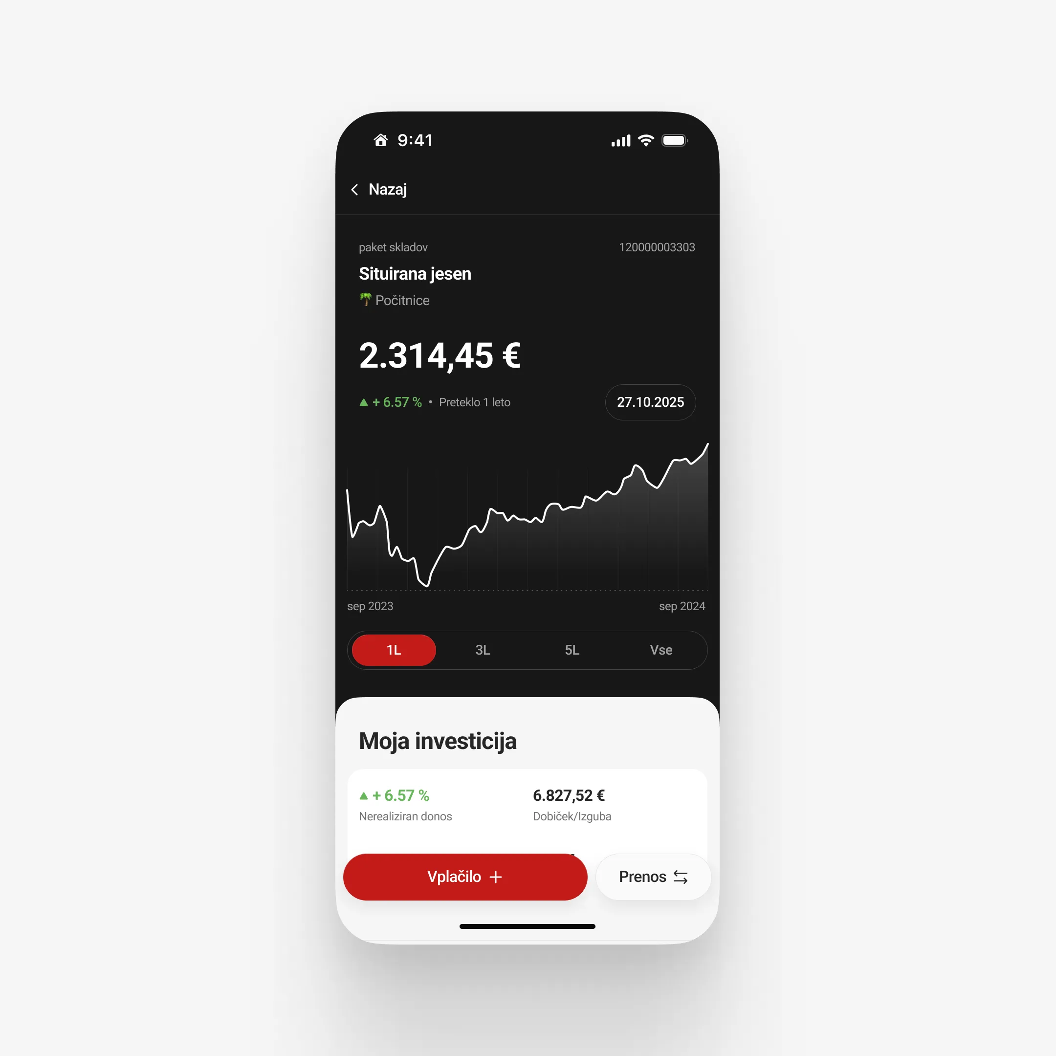
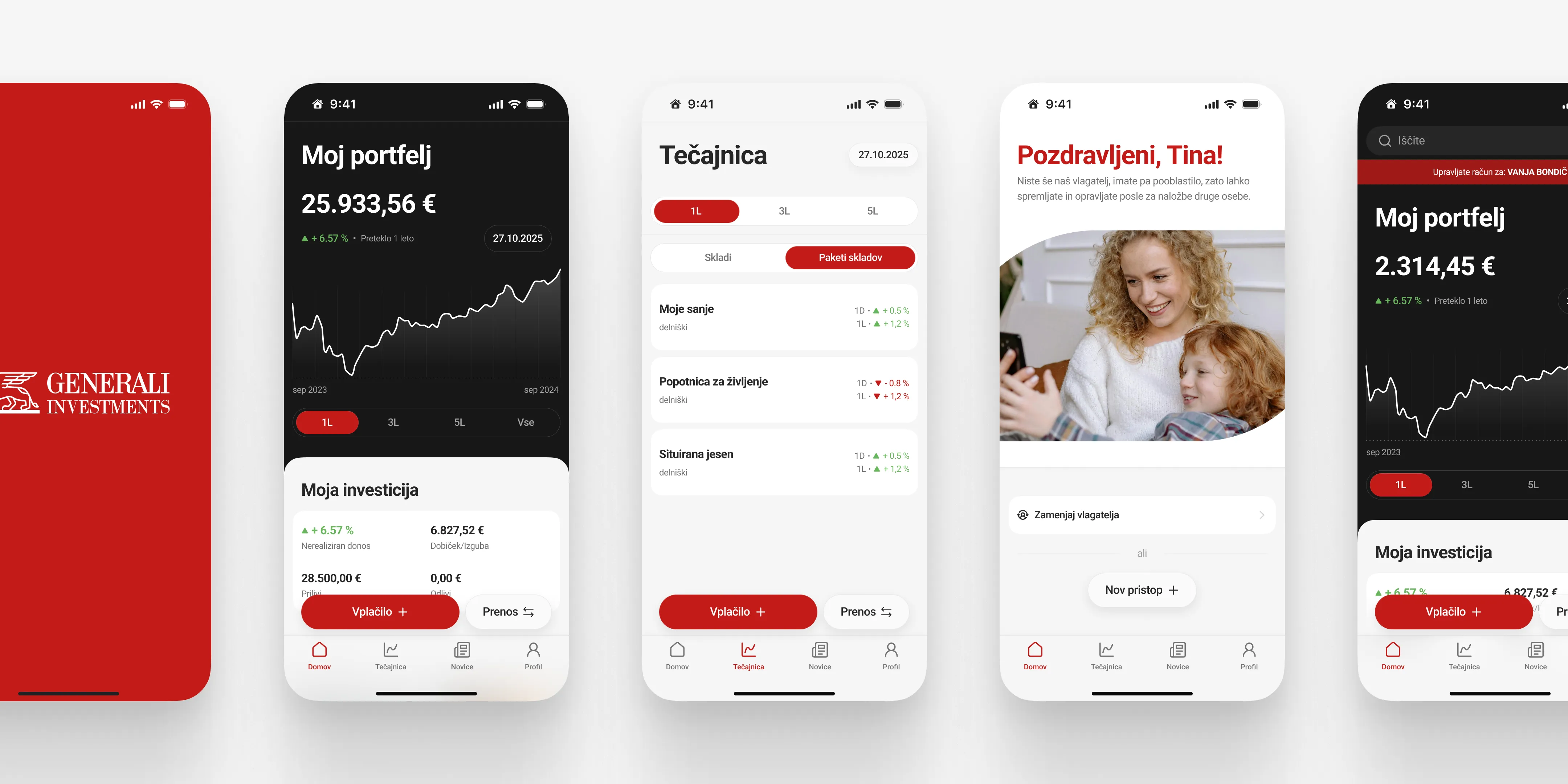
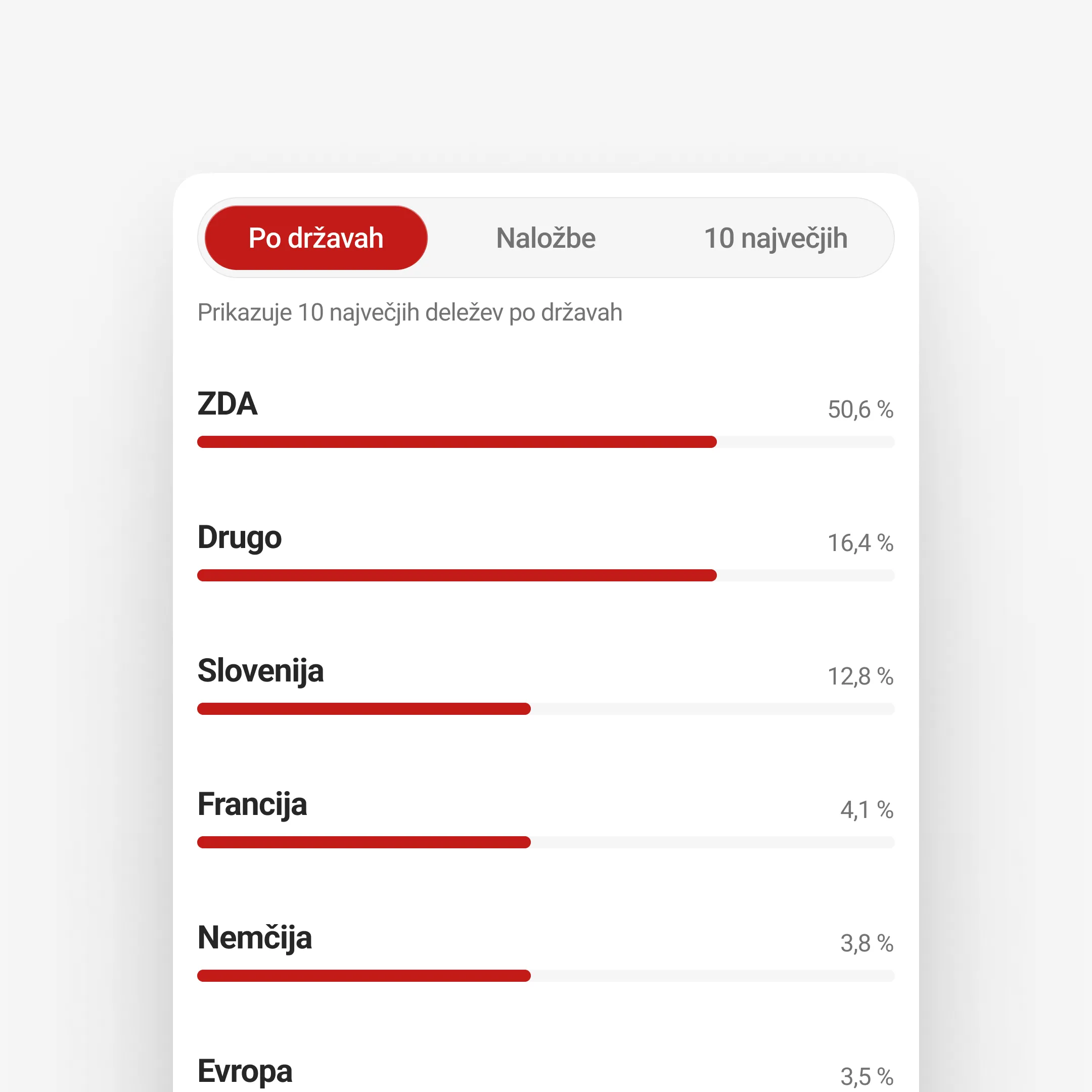
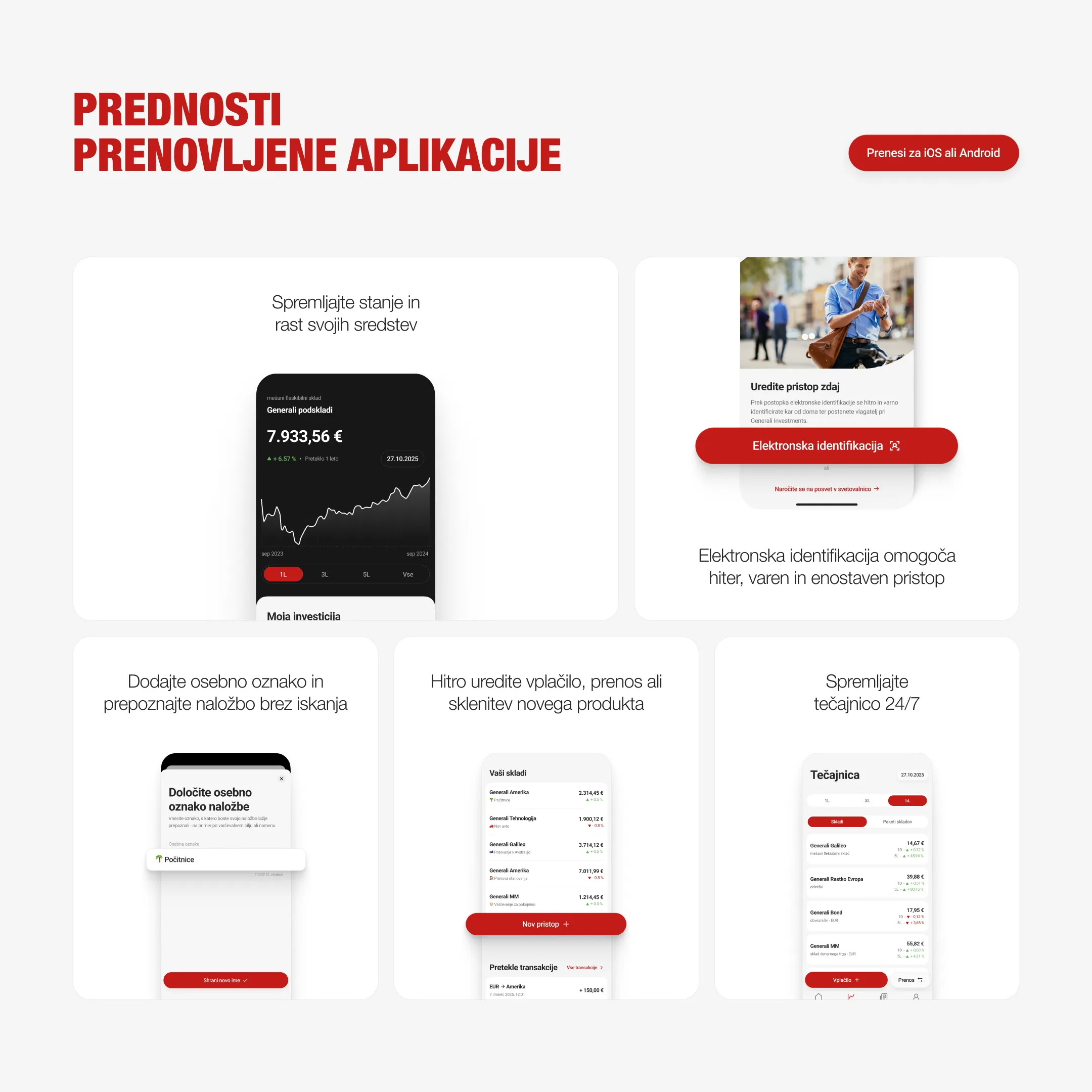
The main design principle became data-first clarity. I wanted the portfolio overview to surface the most important information immediately, then lead into more detailed fund views in a way that still felt structured and manageable.
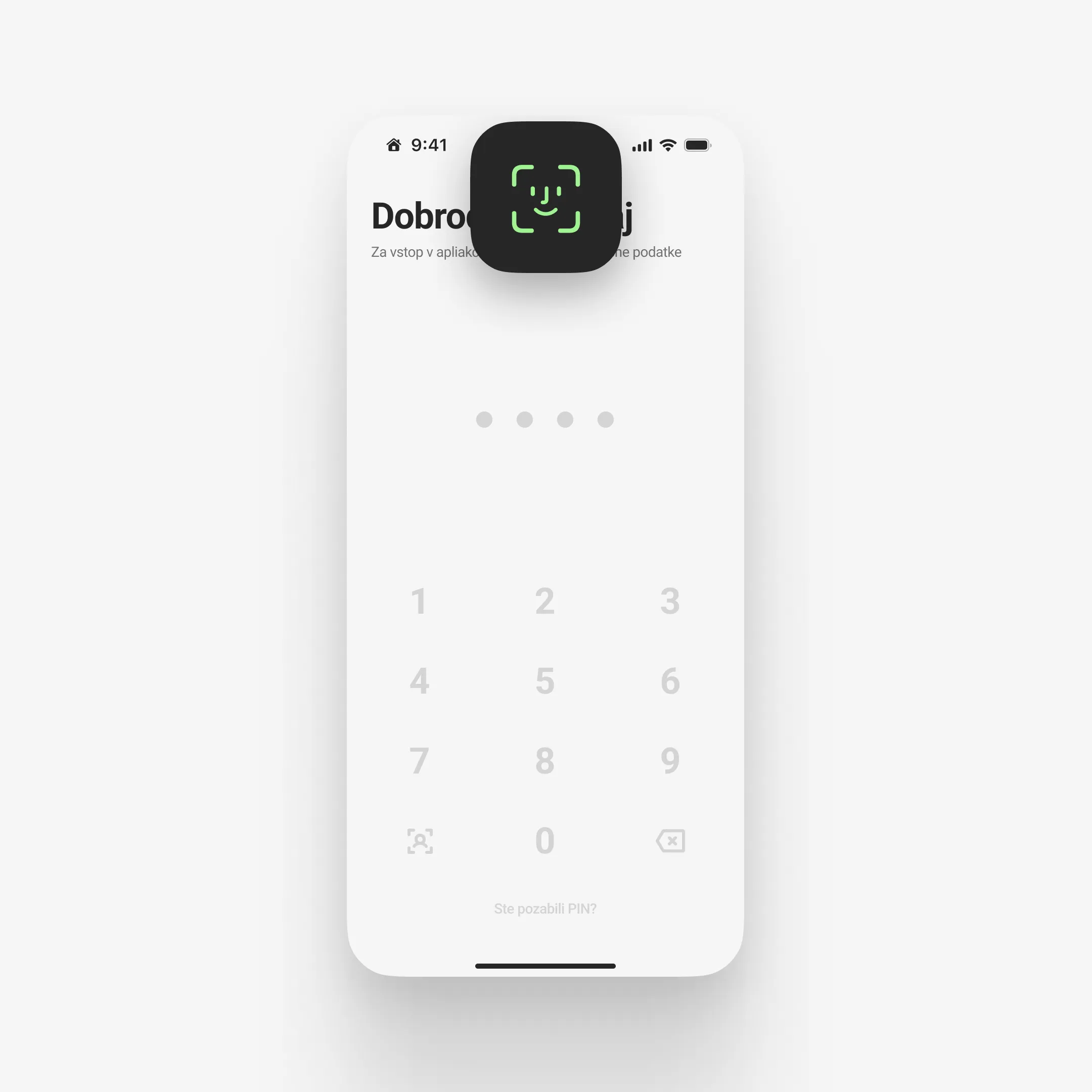
Electronic identification was integrated into the onboarding flow so the app could support full digital access while staying compliant with regulatory requirements. Biometric login also became part of the core experience, because that level of convenience felt important if the product was going to feel truly mobile-native.
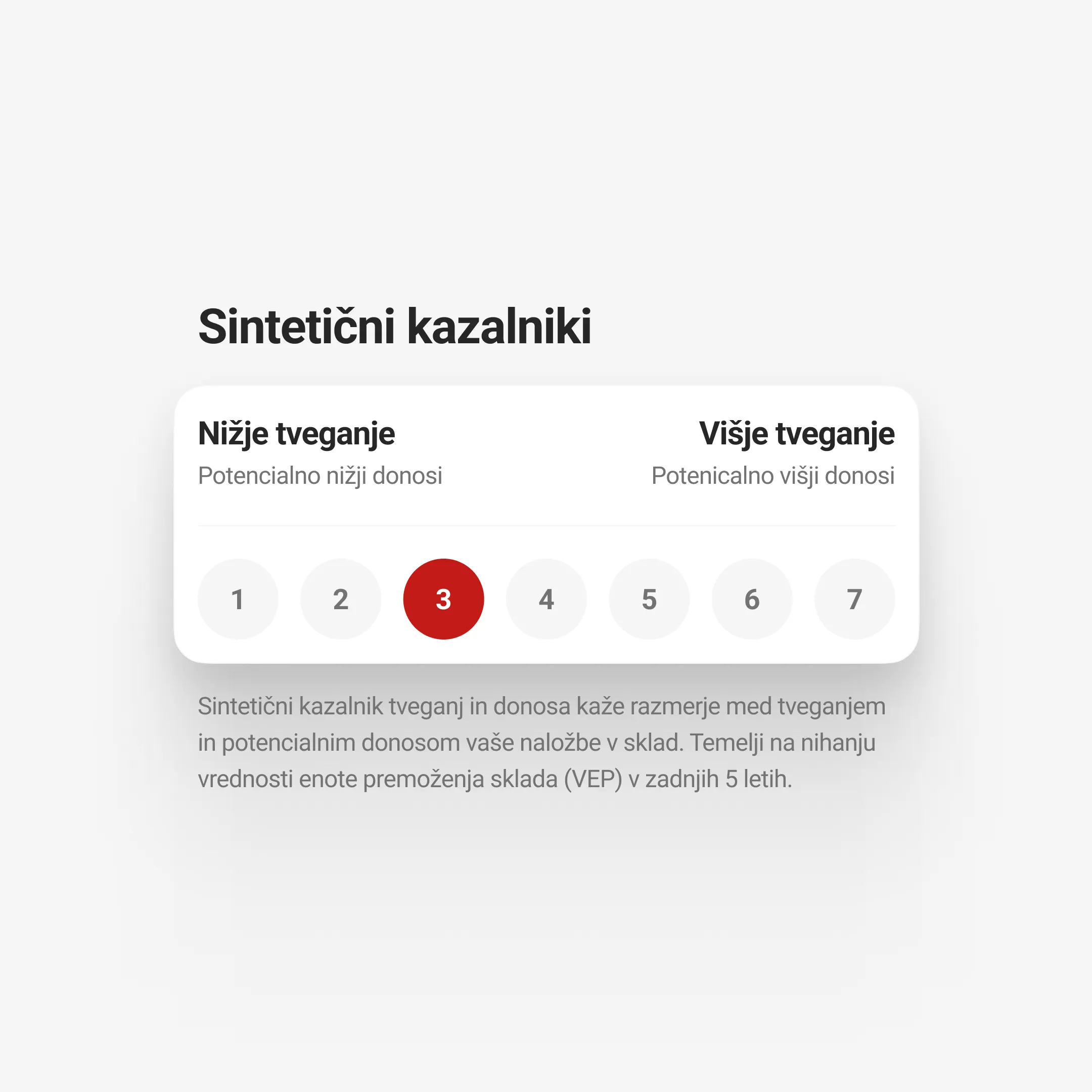
A lot of the design work came down to removing things that made the product feel heavier than it needed to. Deep nested navigation, web-like layouts, excessive use of red, and inconsistent hierarchy were stripped back. Red became an accent rather than the dominant interface colour. The black portfolio card introduced stronger contrast and clearer separation between interactive performance data and surrounding information. Charts were kept visually neutral as well, without automatically shifting into positive or negative colour logic.
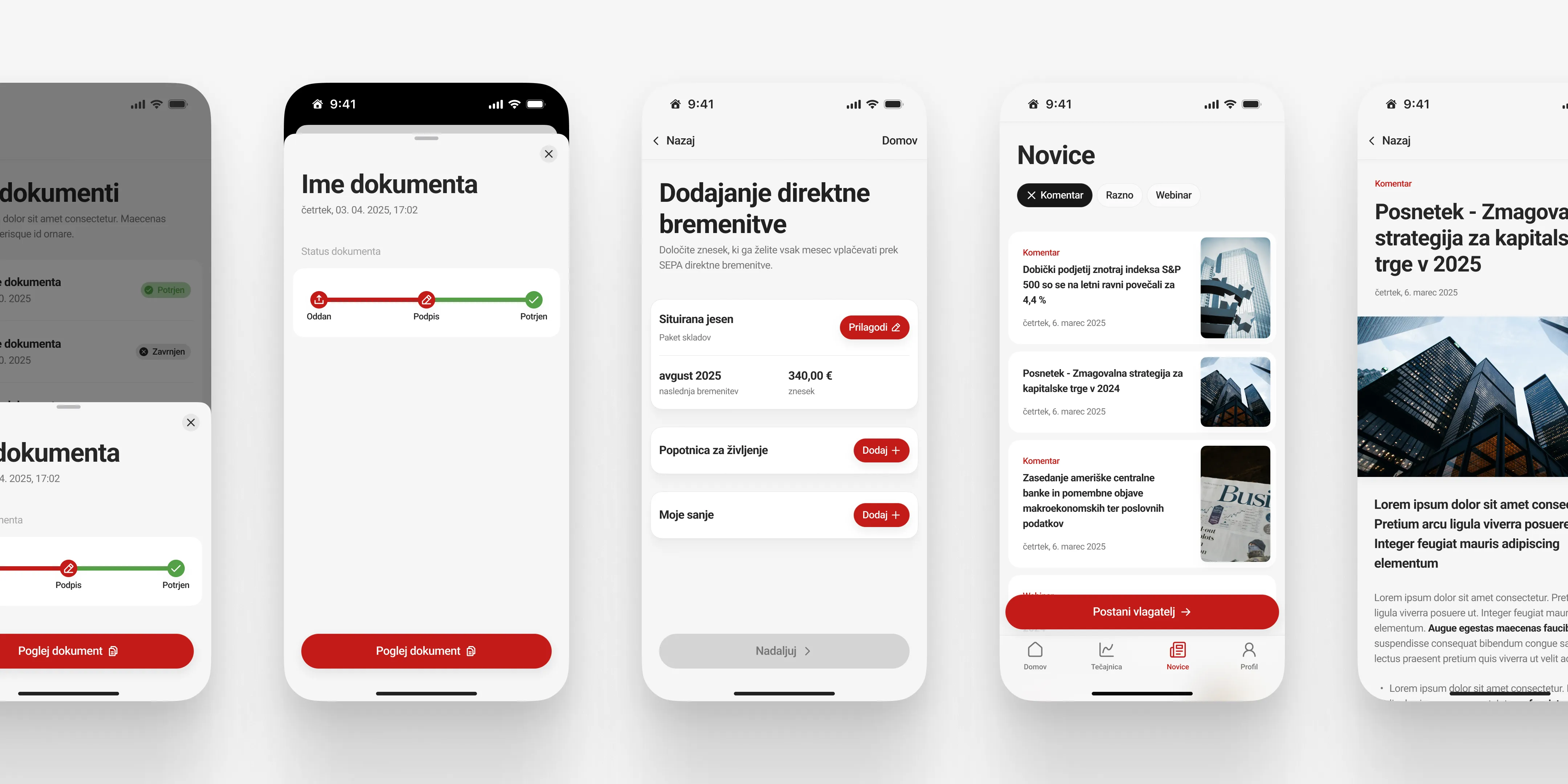
Transaction flows, including fund allocation, SEPA direct debit setup, and inter-fund transfers, were also reworked. Those flows had to stay within backend limitations, so the goal was not to reinvent them completely, but to reduce friction wherever the system allowed it.
Internal testing showed that the most friction was in the more complex transaction flows, especially SEPA setup and multi-fund transfers. Those parts were revised several times.
Stakeholder feedback was mostly centered around regulatory compliance and technical feasibility. Some solutions had to be adjusted to fit backend constraints, which was expected. That kind of back-and-forth was part of the process throughout the project.
The redesign also required continuous coordination with development and marketing teams. That mattered not just for launch, but for long-term maintainability. I wanted the system to be usable in practice, not just resolved at the concept level.
The project contributes to the digital transformation of Generali’s retail investment offering and creates a foundation for continued iteration within regulatory and technical boundaries.
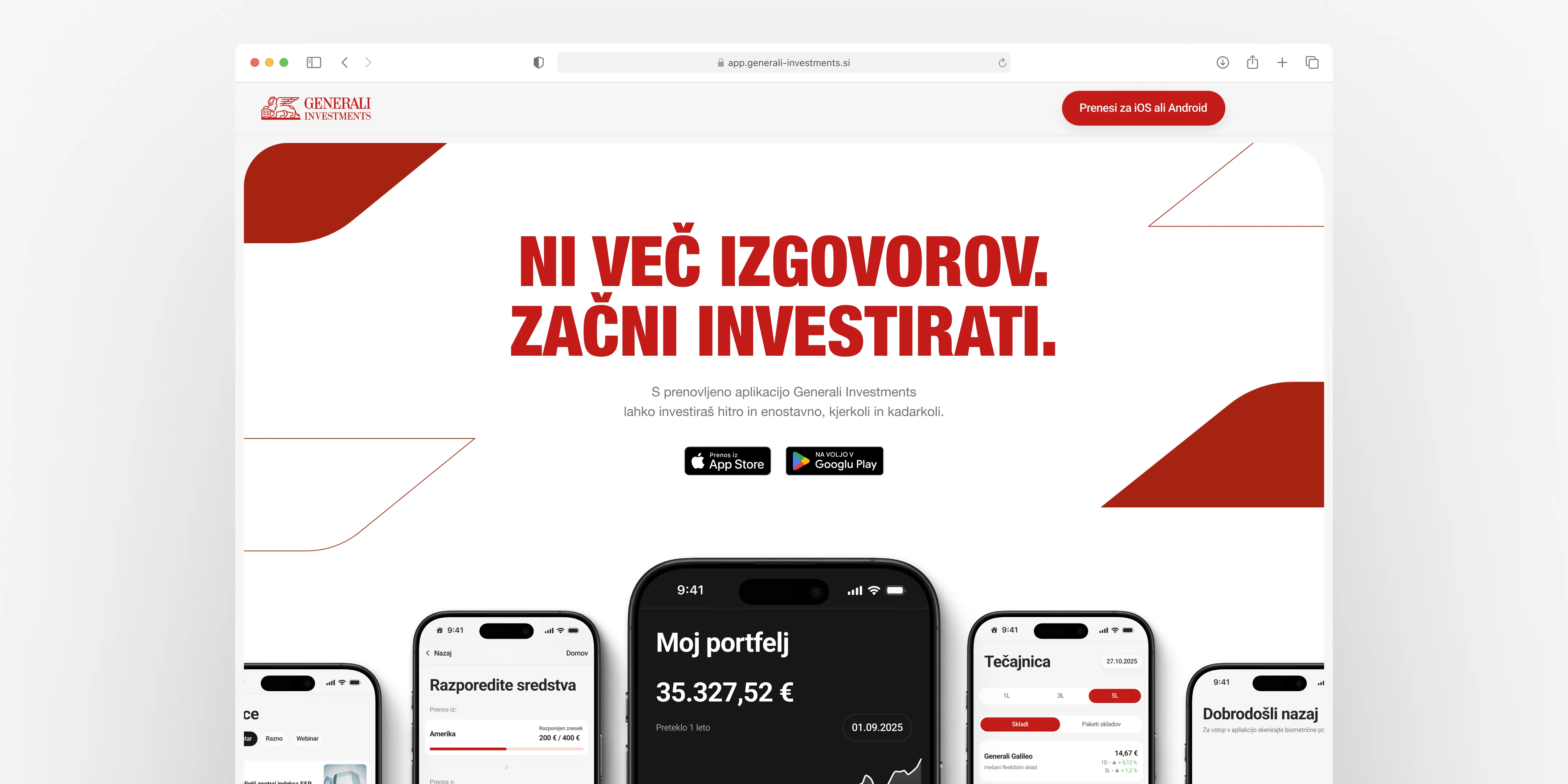
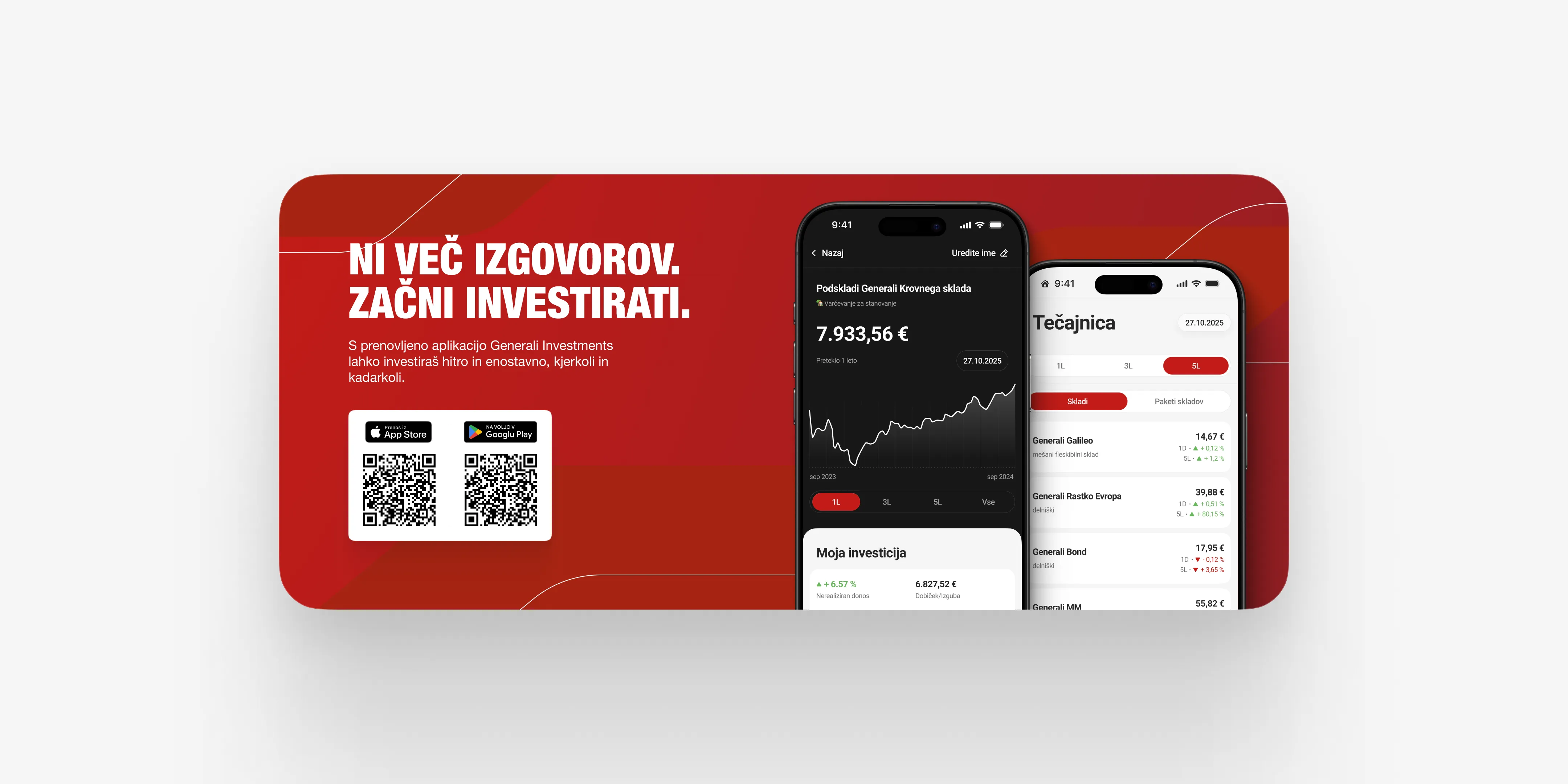
The app is live on iOS and Android. The redesign established a mobile-native structure for onboarding, portfolio management, and transactions, and helped shift the product away from a web-adapted interface toward a more coherent mobile system.
If you want, I can do one more pass and make it even closer to that case study’s voice by making it slightly more personal and opinionated.