PROW
Designing an Occasion-Driven Beverage Brand
Most beverage e-commerce stores are either trying to sell as many bottles as possible, or trying to compete with big grocery chains on price and convenience. That was never going to be a strong position for a startup.
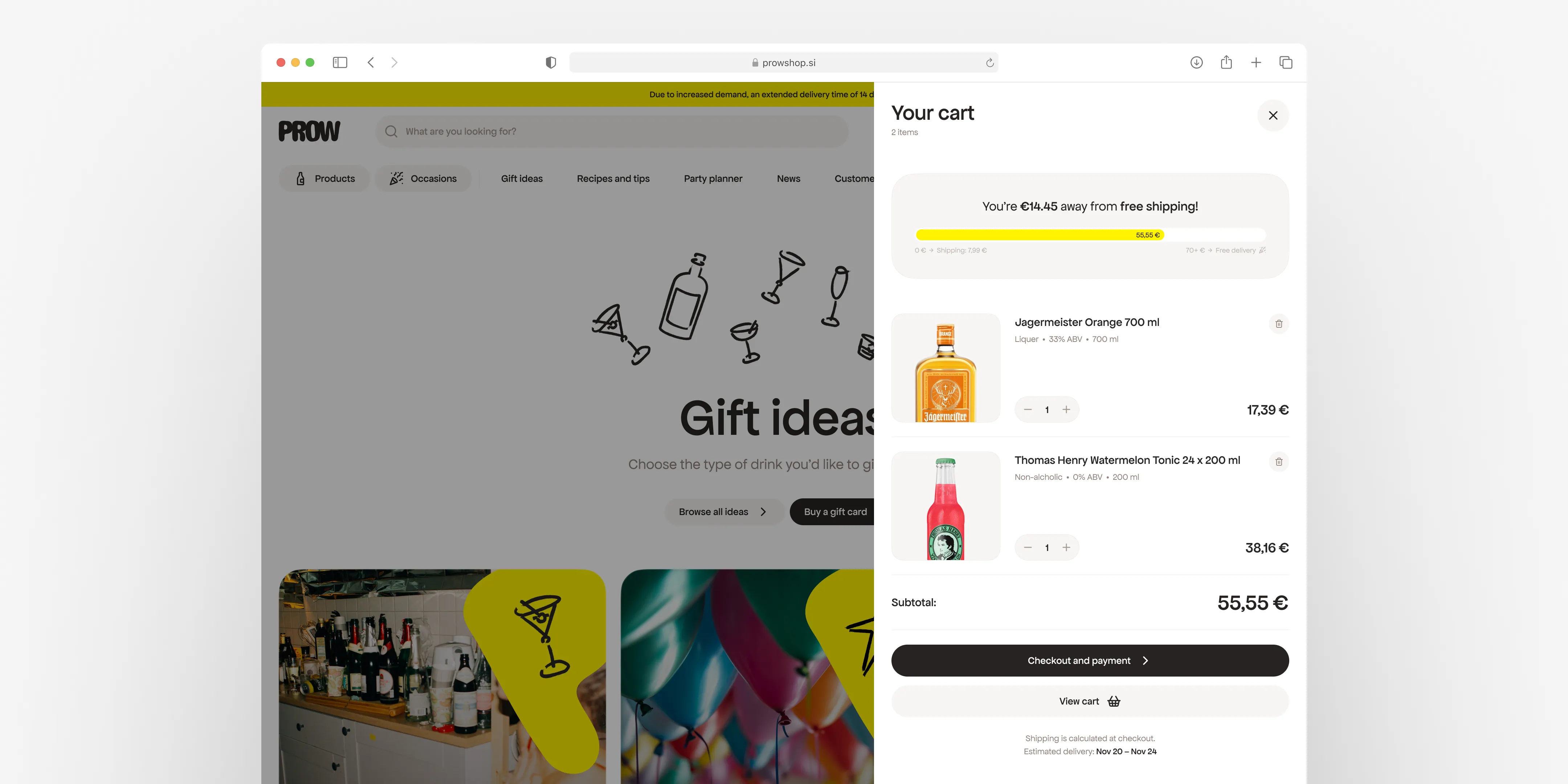
What felt more interesting was the gap in between. There was no real marketplace for alcoholic and non-alcoholic drinks built around occasions. Not just buying bottles, but helping people create the setting around them. Gifts, recipes, ideas, pairings, atmosphere, and a more responsible way of drinking. Something that could make drinking at home feel a bit more intentional, a bit more special.
That was the real opportunity behind PROW. Not another store. A more guided experience.
My role on the project covered branding, brand strategy, and product thinking, but this case makes the most sense through the branding side because the brand decisions ended up shaping the product too.
I kept coming back to a simple question while thinking about it: how do you take the feeling of shopping somewhere like IKEA and bring that online? Not literally, but in the sense that browsing itself becomes part of the experience. You discover things. You imagine situations. You move through a world, not just a catalogue. That was the direction that mattered to me.
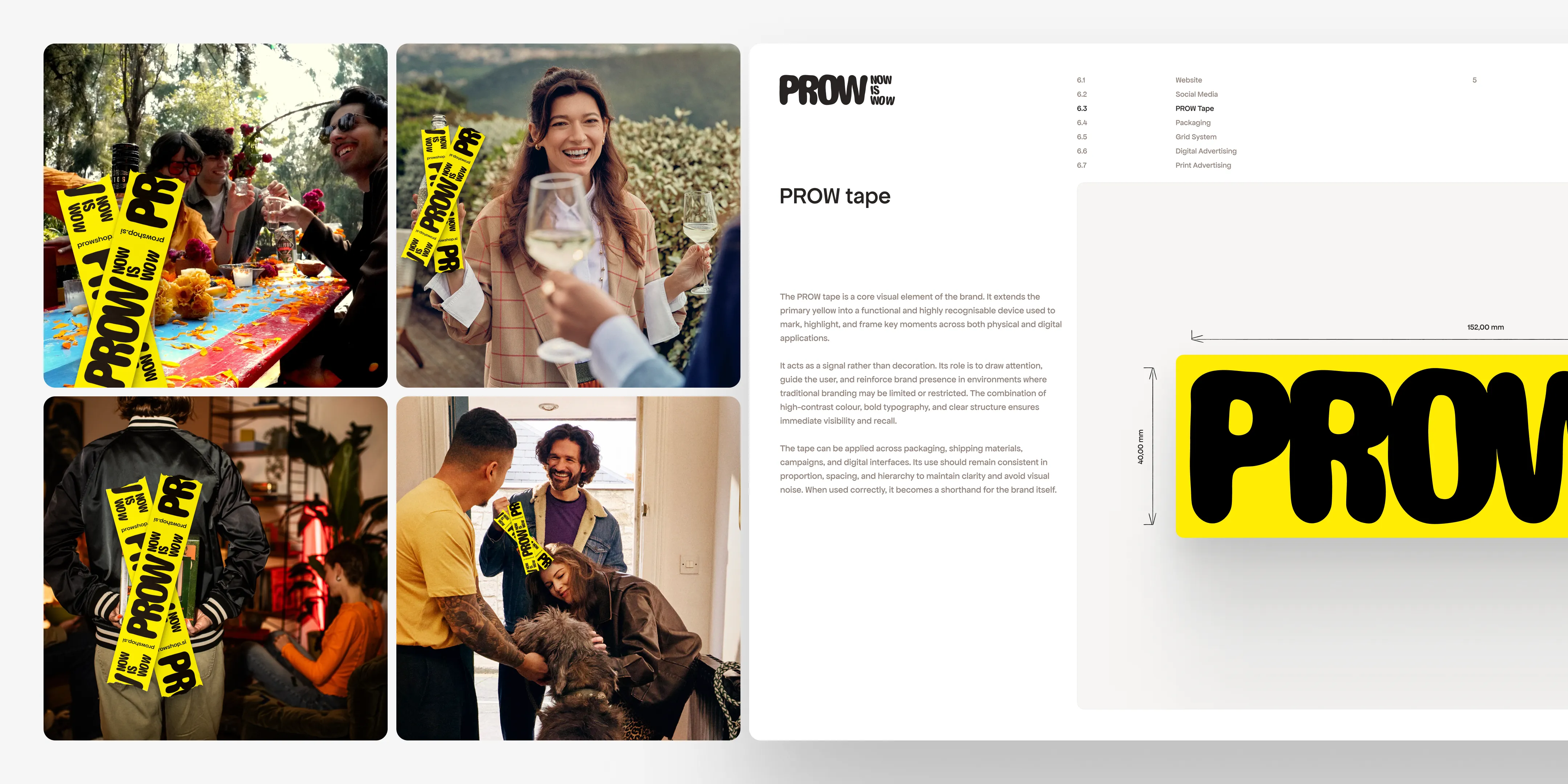
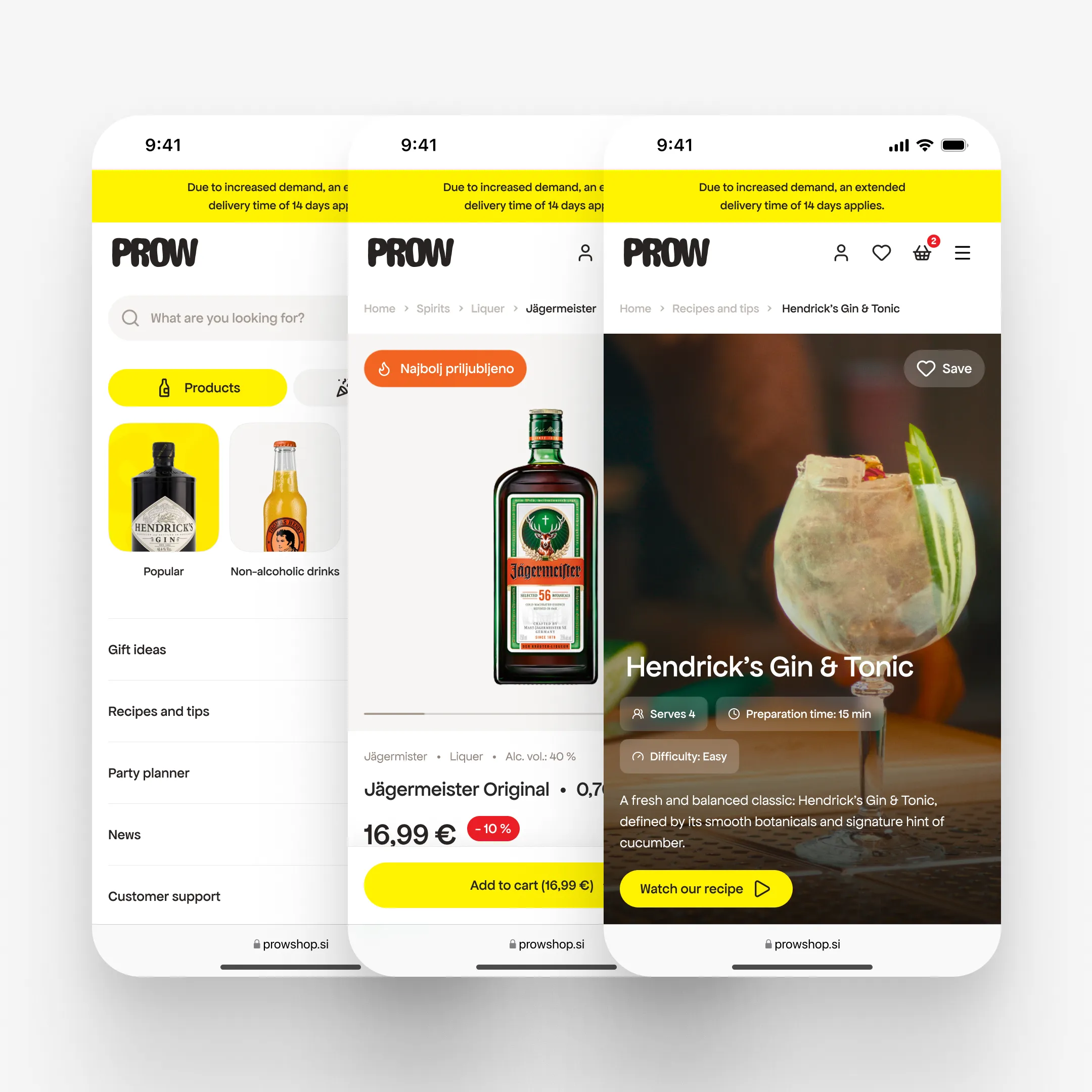
One of the biggest constraints was alcohol regulation in Slovenia. The category is restrictive, and that changes how you think about visibility. It was not enough to make something attractive. It had to work in a market where you are partially censored, where showing products directly is not always possible, and where brand recall has to do more of the work.
There was also the reality of startup budget. That is exactly why I wanted the brand system to be visually strong but also easy to implement across the whole chain, from identity to content to development. I always try to work that way. If the brand is beautiful but awkward to use, it slows everyone down later.
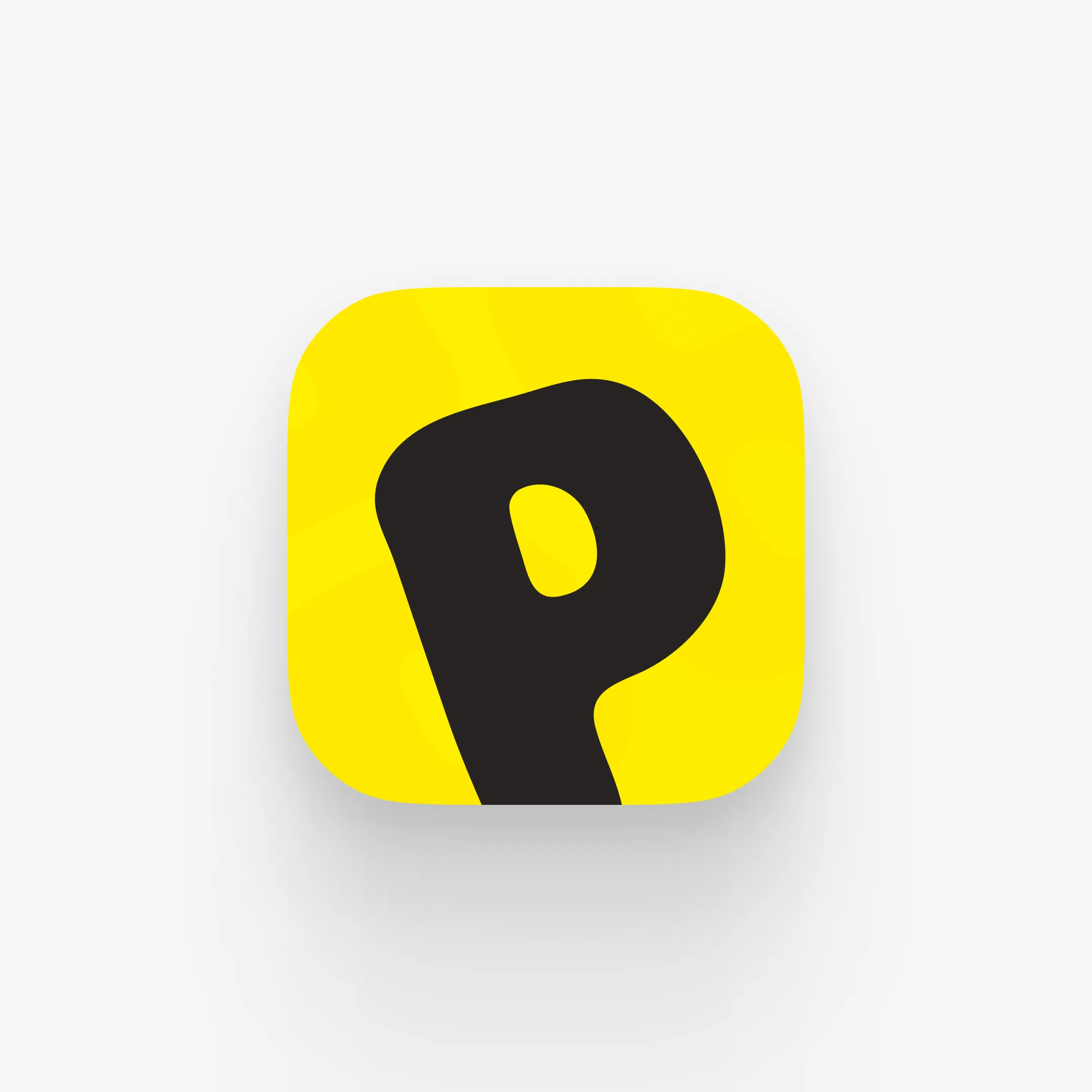
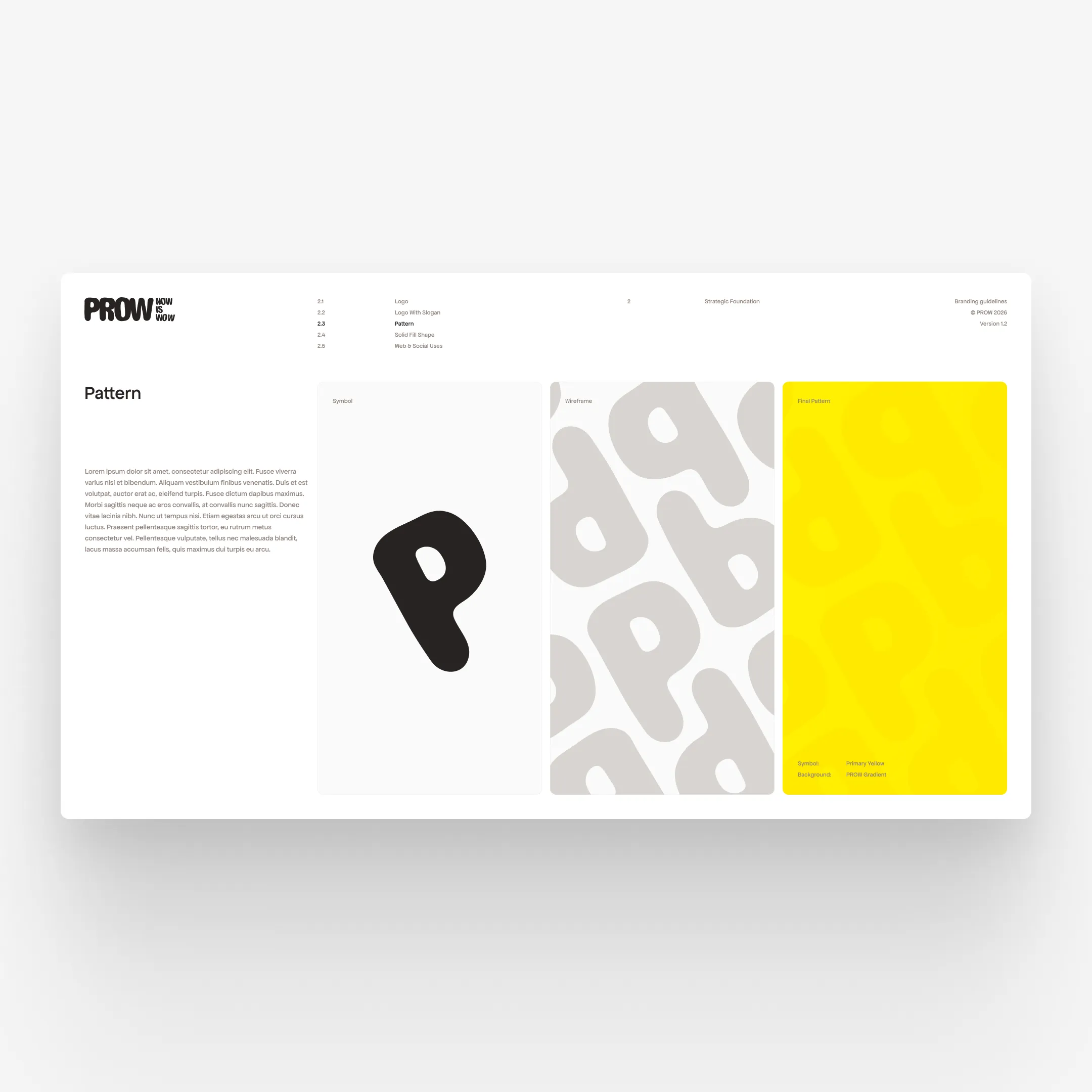
The logo was designed as an organic form. It felt playful because of the shape, but still simple enough to stay professional. The rest of the identity followed the same logic. It needed to be playful, clear, memorable, and easy to scale. It also had to work well in print and digital without becoming inconsistent.
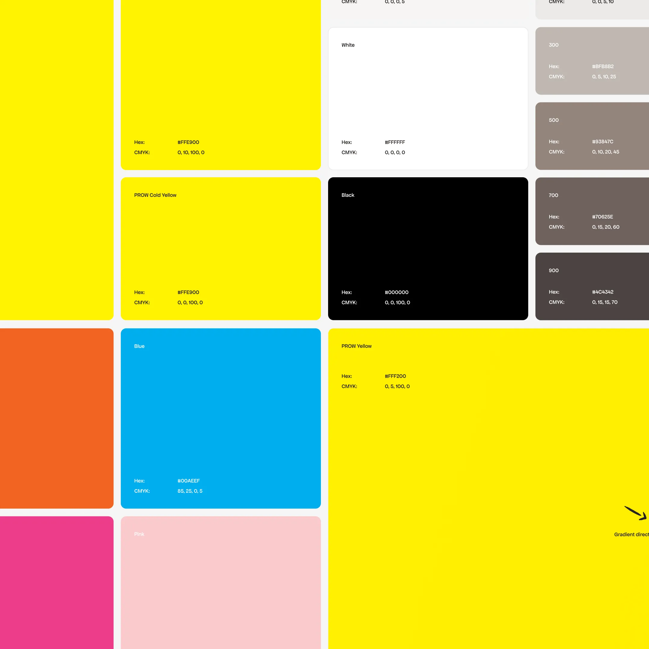
Yellow became the main brand colour partly because of what it communicates and partly because of production logic. It is warm, vivid, and open, but it also has a warning quality that turned out to be really useful for this category. In print, we could get strong visibility with a near-pure yellow in CMYK without relying on expensive Pantone colours, which was a practical win for a startup.
For typography, we chose Apfel Grotezk. It is a slightly funky sans serif, professionally drawn, open source, and quite uncommon in this space. That made it feel distinct right away.
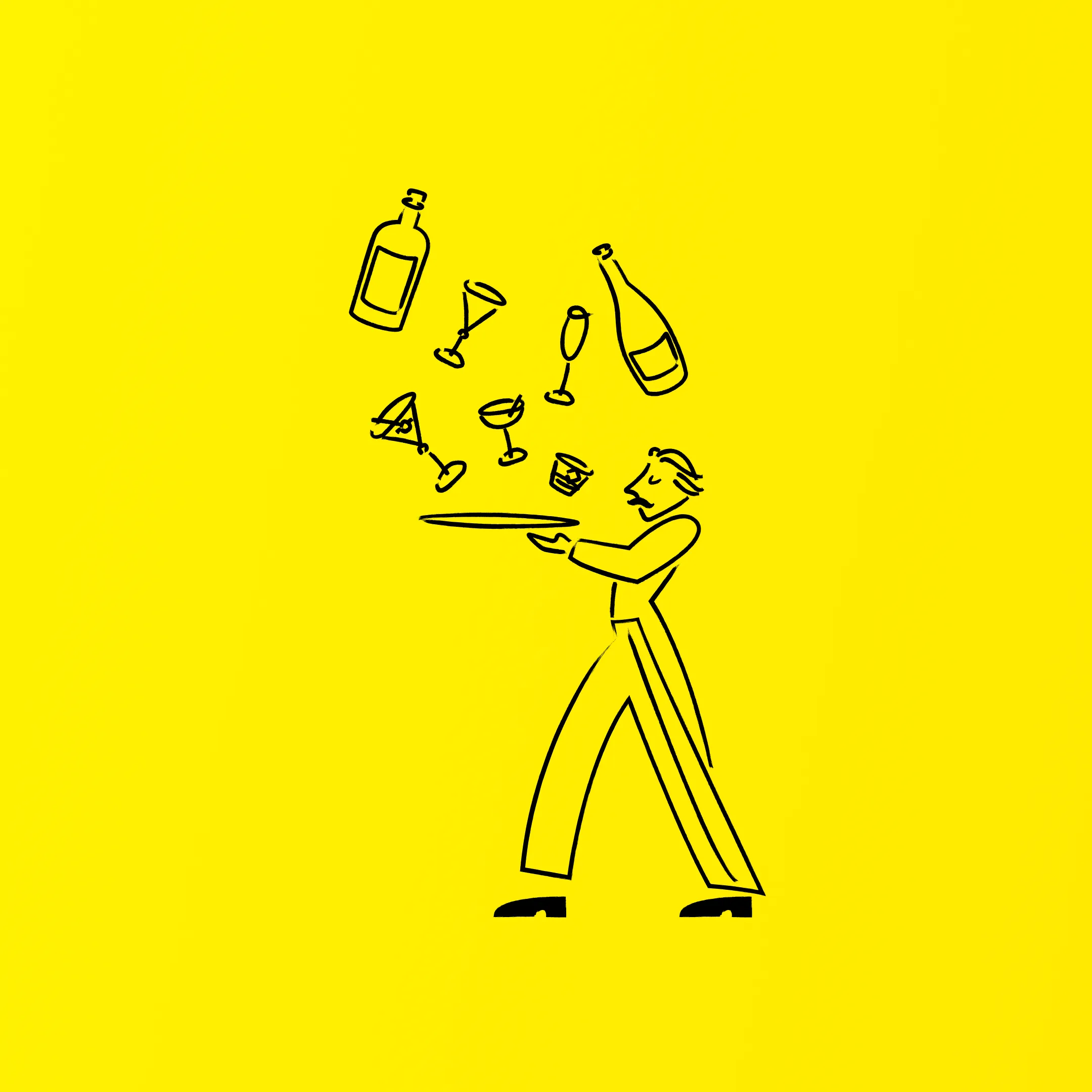
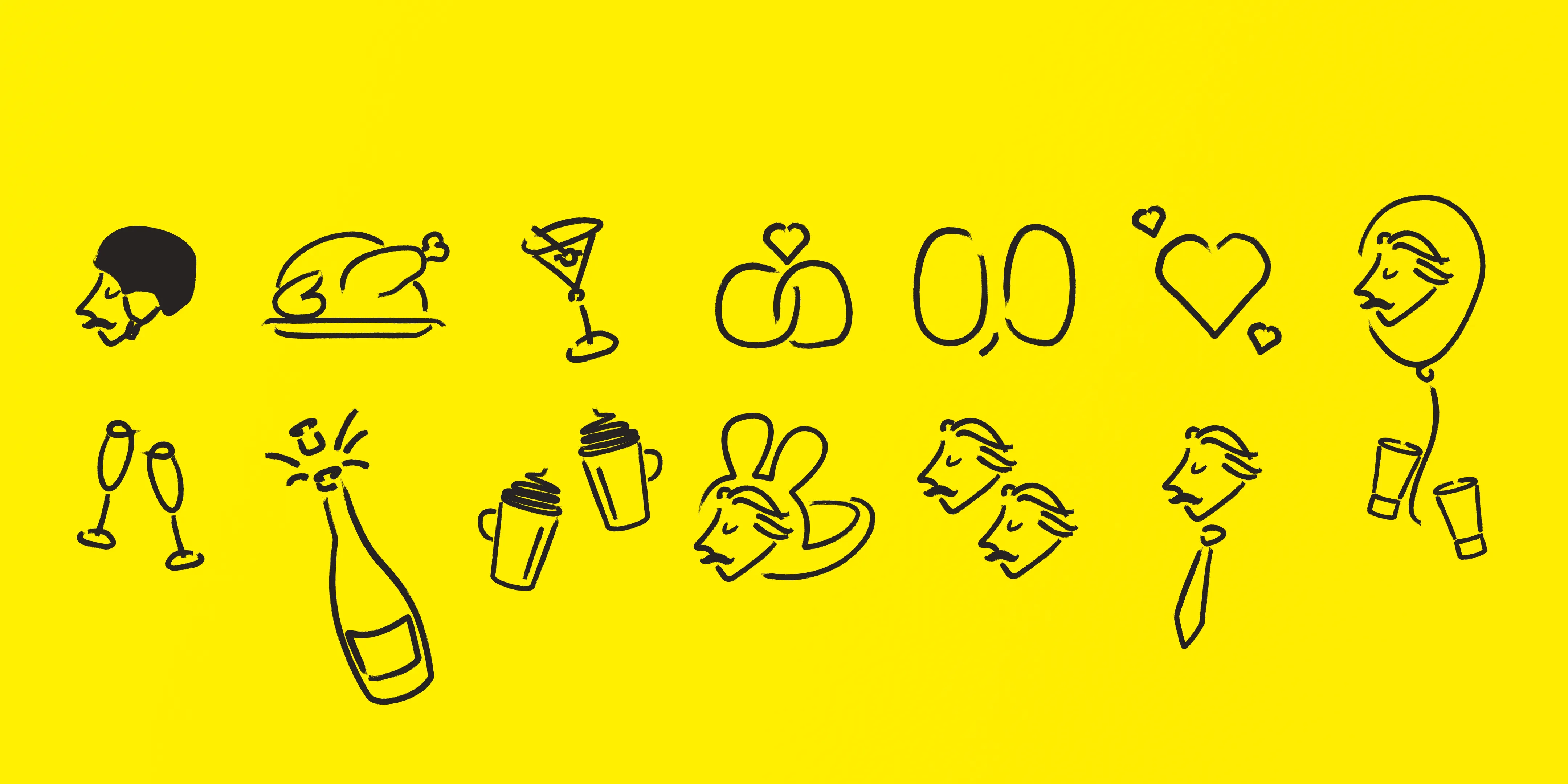
The illustration system really became the heart of the brand. No one else in the category was using illustration like this, and it immediately gave PROW a more ownable and playful identity.
We tested flows and concepts both internally and with the co-founders’ team. The overall direction held up well.
The illustrative style itself was intentionally simple: vector-based, line-drawn, slightly hand-drawn in feel, easy to scale, and easy to reproduce. That was important. I wanted a system another designer or illustrator could pick up quickly without spending days trying to decode it. It was a small step that made the brand more sustainable when onboarding new designers.
It also solved a practical problem. By combining illustrations with photography and video, we could take almost any piece of content, whether stock or original, and make it feel much more like PROW. That was useful both for brand consistency and for content production.
Some parts of the branding also had to be simplified before launch because of time constraints. Illustrations became cleaner, and the interface stayed more restrained, which in hindsight was probably the right move anyway. It kept the focus on products and occasions rather than pushing the branding too hard in every corner.
By the end of the process, PROW had a much clearer identity, a stronger strategic foundation, and a visual system that could carry through the whole brand, from the webstore to content to print applications.
What I still like most about it is that the brand was not just decoration layered on top of an e-commerce platform. It shaped how the store worked, how users moved through it, and what the whole thing stood for. The occasion logic, the moderation angle, the tape, the butler, the illustrations, they all came out of one way of thinking.
If I were continuing the project, I would focus on refining some of the brand applications further so they become even easier to reproduce consistently, and on improving parts of the UX based on real user feedback and conversion behaviour.